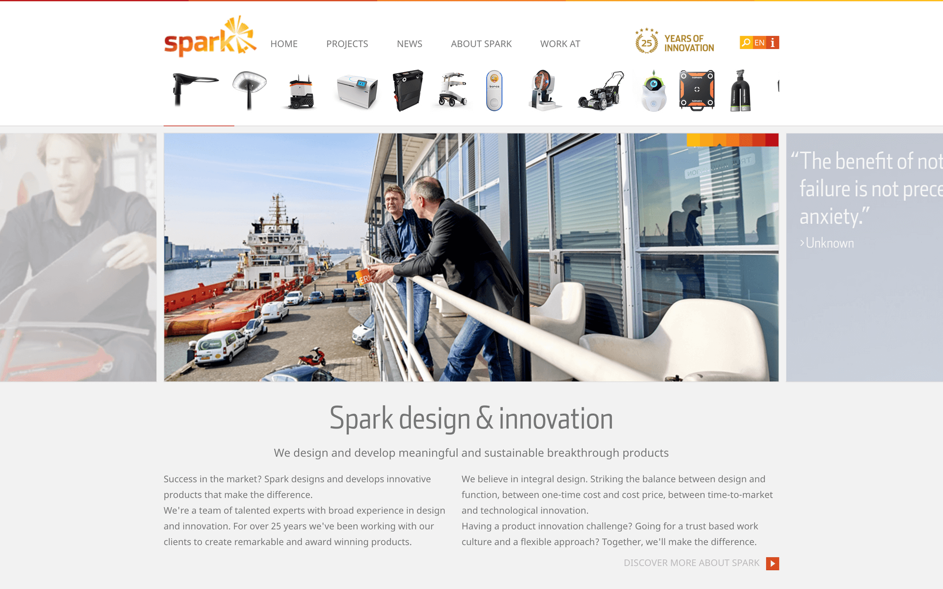
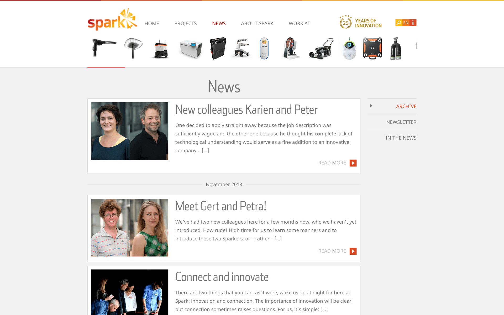
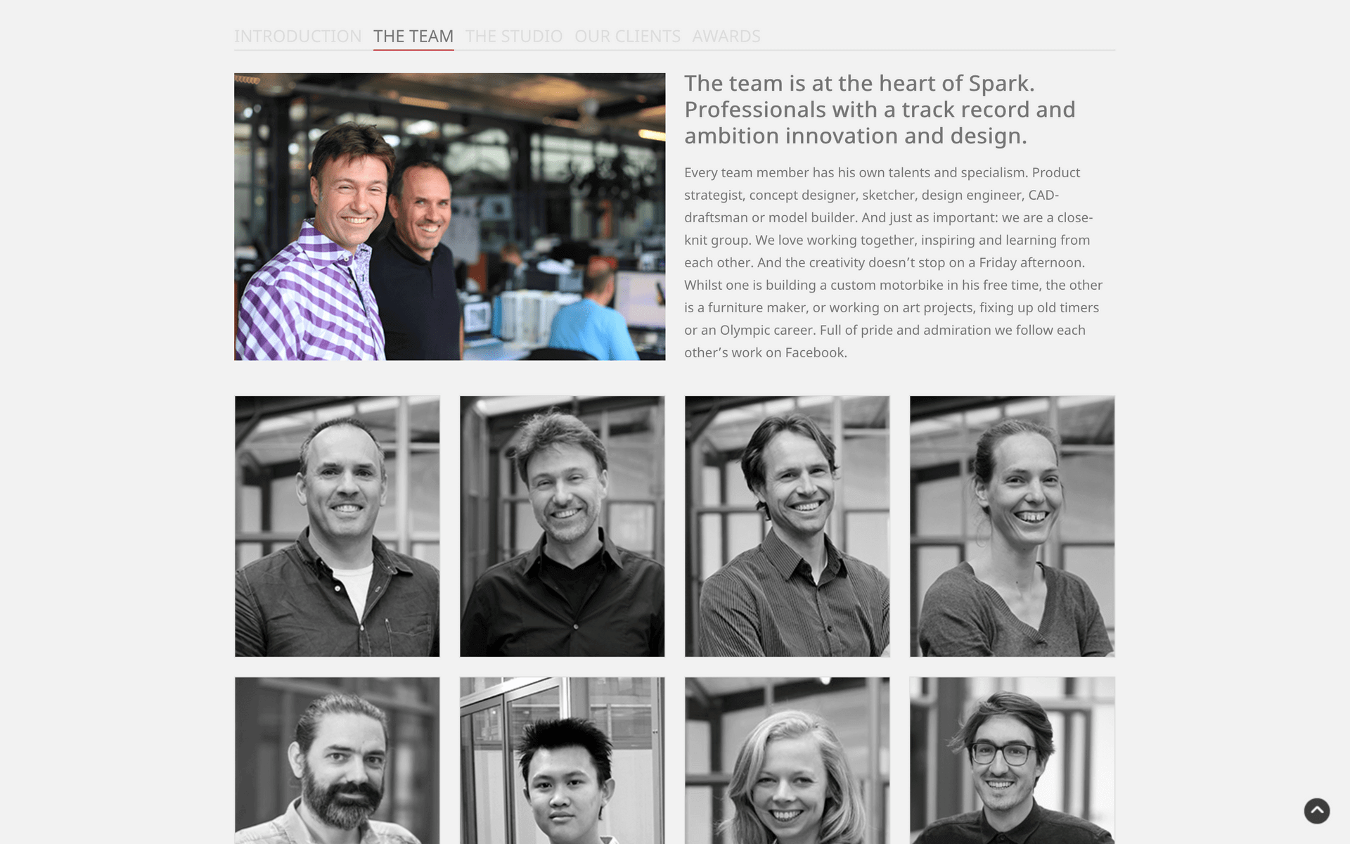
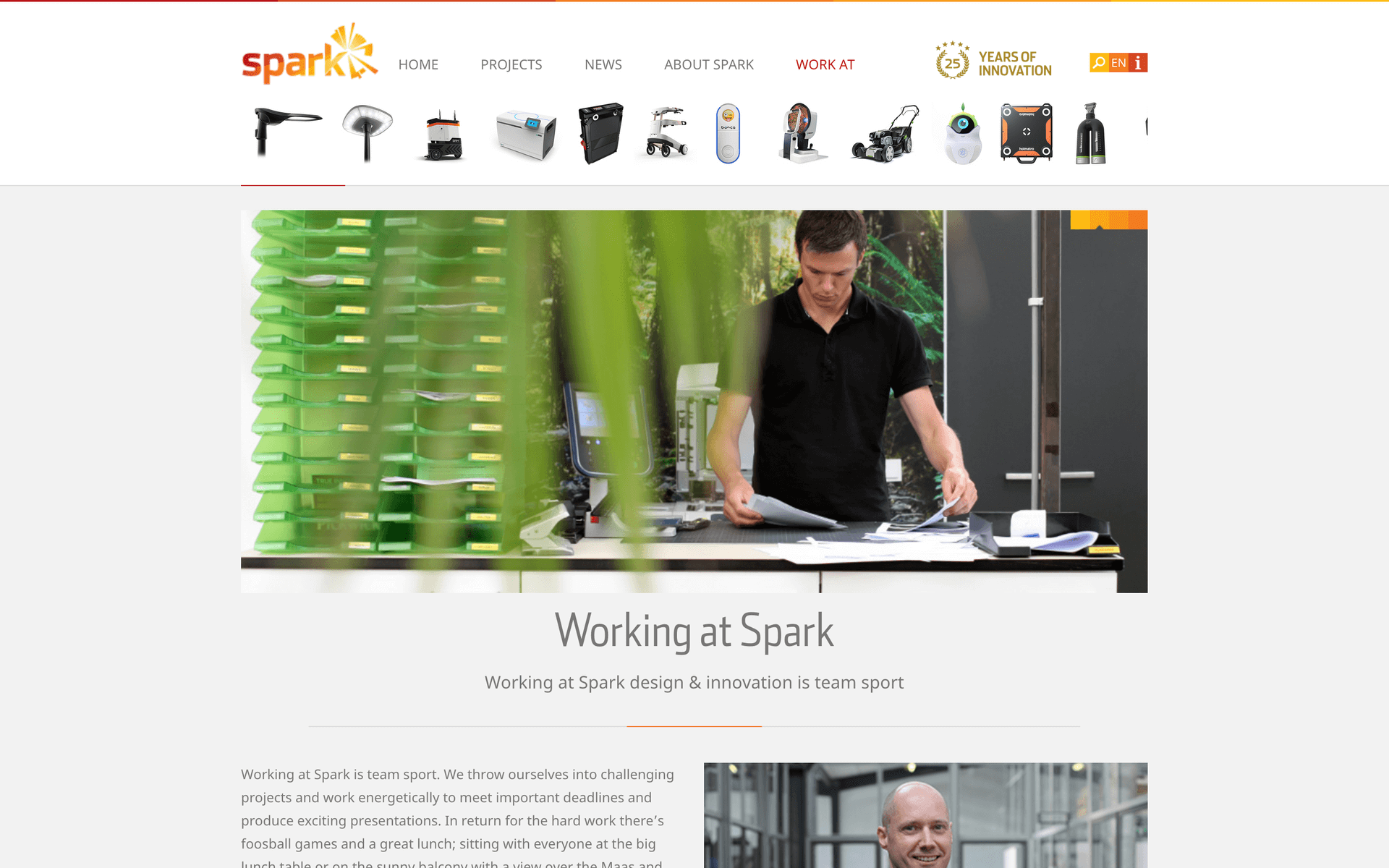
As a part of my job at the design studio Spark design & innovation I was responsible for the design of their new website. This was a fun and interesting project with a lot of freedom for me as a designer, but there were also many stakeholders involved. Because it is a design studio everyone naturally had an idea of how the website should look like.
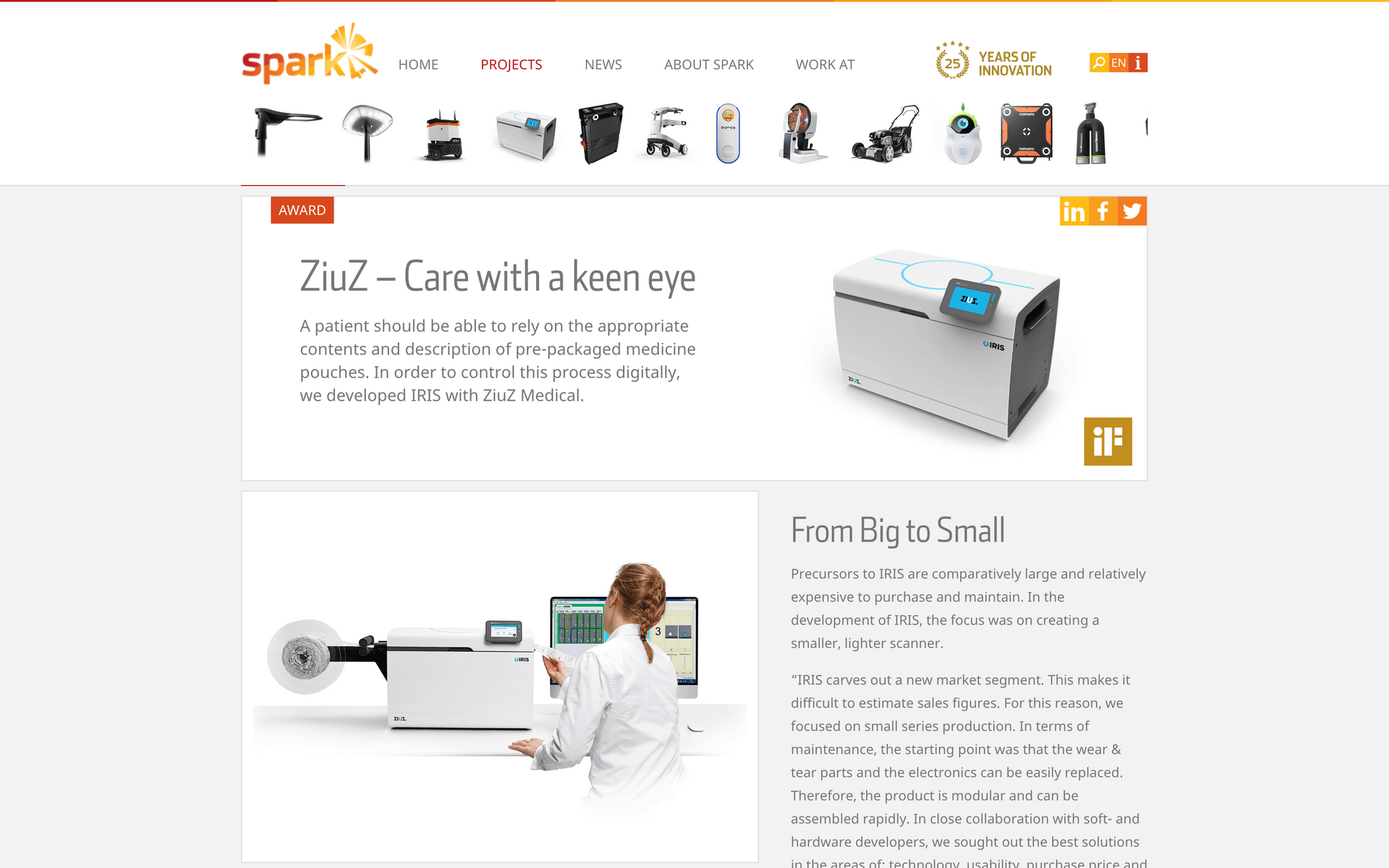
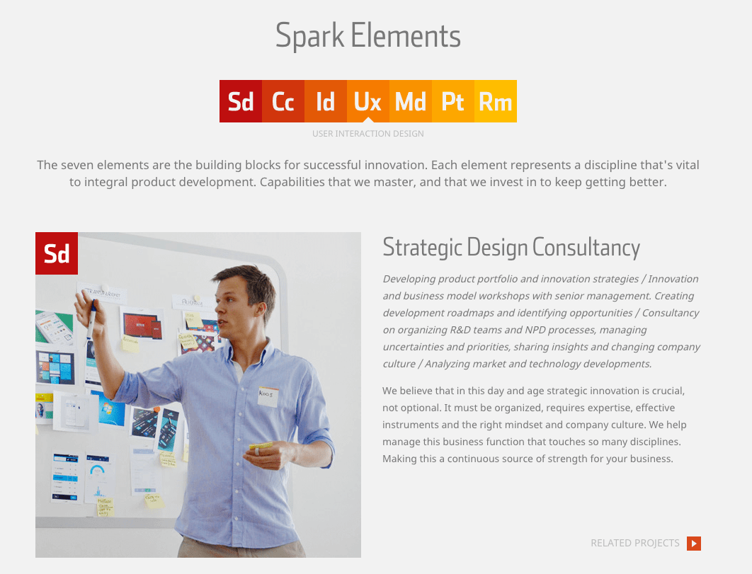
The design of the website was built completely from the ground up, and tailored to the needs of the design studio. We came up with the ‘Spark elements’: a set of seven icons that represented the seven different competencies of the studio. These elements were displayed at each project page to show which competencies were used. The icons all had different colours, and these colours were also used throughout the entire website.
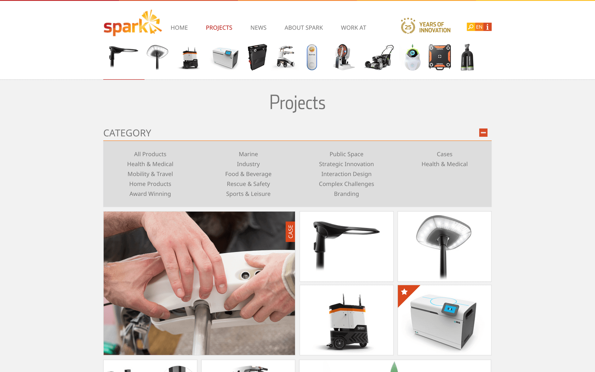
A project slider was visible at the top of the website, so every visitor could immediately get an impression of the projects the studio was working on. The project overview page showed all the projects as large thumbnails, but by using the filter visitors could filter certain project types. Besides normal project pages, there were also some project cases which explained the process of a project in depth.
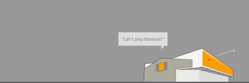
The website contained many carefully crafted details. For example, small squared icons were used as navigation buttons, and were visually related to the larger element icons. But, the design also had some fun. If you visited the website multiple times and looked at the footer, the image of the studio’s office would change every time. In addition, funny quotes were displayed to show the studio’s culture. And on special days, like Christmas, the image and quote would be themed up to that particular day.
You can check out the website here.


