We all use email. It is quite convenient, but also very prone to error. More than half of all data breaches occur due to a human error, for example accidentally sending information to the wrong person. Also, it is still very easy for hackers to hack mailboxes.
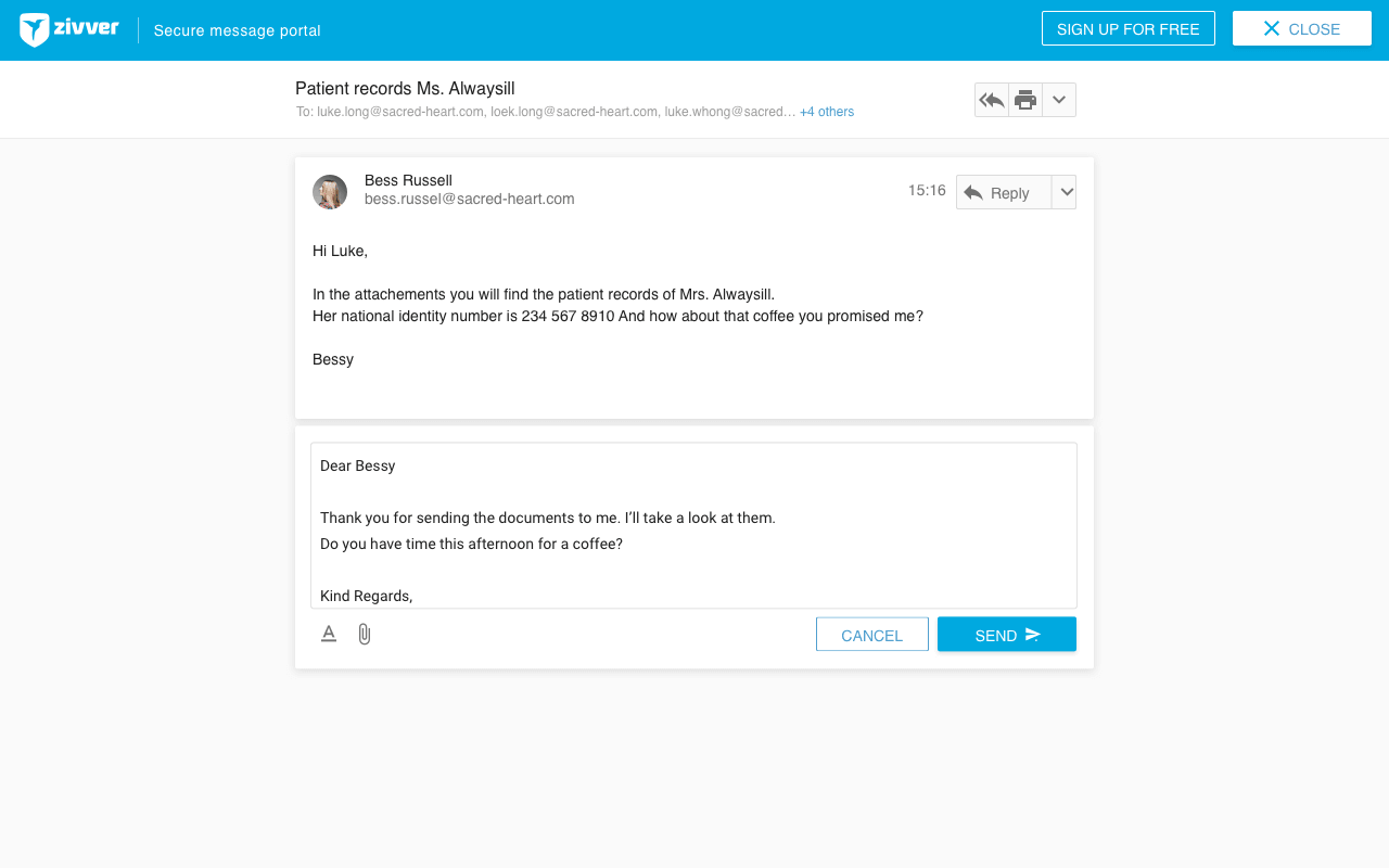
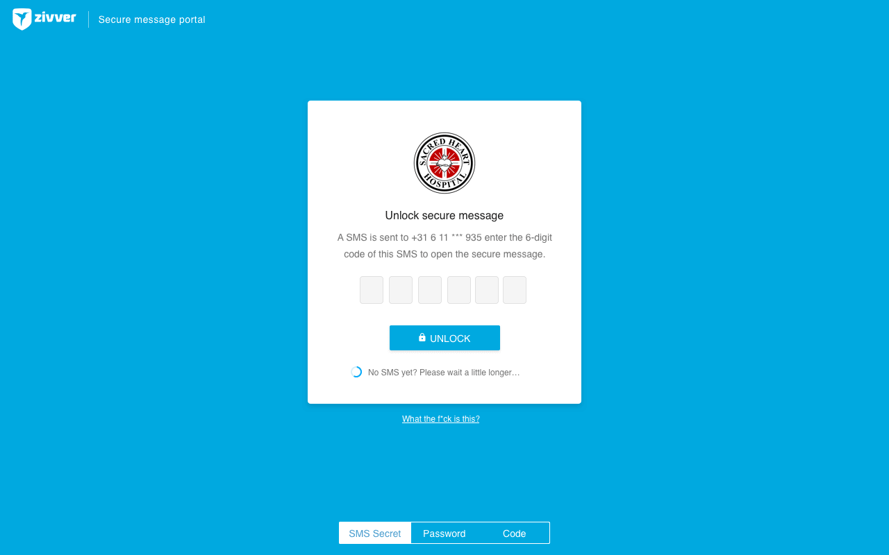
With ZIVVER’s SaaS solution, you can secure your email in a user-friendly way. As the receiver doesn’t need an account to open a secured ZIVVER message, everyone can receive it. This was a big challenge from an UX point of view: not only an elderly person, but also a teenager should be able (and willing to) open the ZIVVER message in his or her mailbox.
After the first clients started to use the product, we noticed that we received an increasing number of calls of users who where unable to open the message in the so called ‘guest’ environment. This guest environment is the web-app you enter after clicking on the button in a notification mail when you don’t have an account. Because it is ZIVVER’s most important touchpoint, we decided to dive into the feedback. We divided this feedback in two categories:
Create idiot-proof UI
- Instructions for opening a message are unclear.
- The download button is not directly visible.
- It is unclear how to reply to a message.
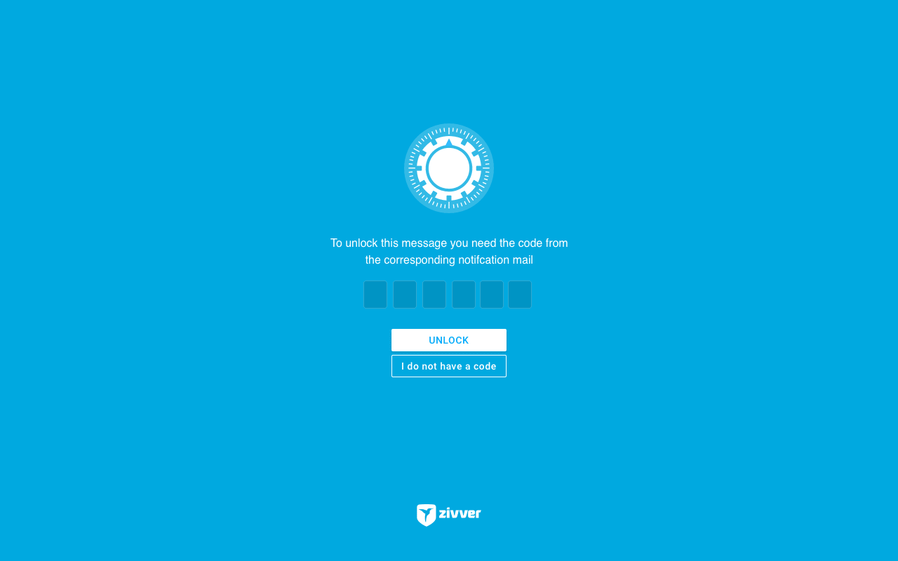
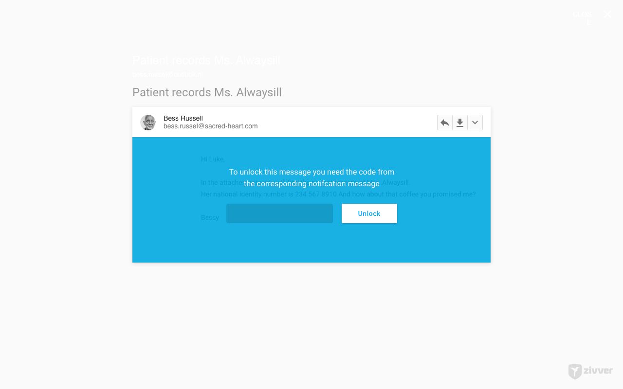
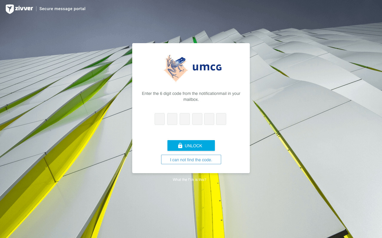
- The code entry fields are unclear.
Increase feeling of safety
- Users think the message is unsafe.
- It is not clear if a message has been sent.
- ‘SEND AGAIN’ is hit many times.
- Many users leave the page open; making it easy for other people to read the message.
Create idiot-proof UI
Make the interface clearer
For the user interface of the guest environment we used a platform that uses the design elements of Google Material. But, we found out that Google Material is not meant for everyone. We have become used to all its design patterns, and the guidelines have been improved last year. However, if you have never touched an Android device before, a lot things are unclear. One of these things is that in many cases only icons are used on buttons. This saves space on a mobile phone, but if you are not familiar with the icon, it is hard to figure out what the function of the button is. That is why we decided to add labels to the buttons.
We also noticed that (especially the elderly) could not always recognize the blue line as a field that required input. I think we have become used to Google’s minimalism, but it lacks discoverability. So we decided to make the input fields more recognizable, by adding borders and a light grey background. One year later Google did the same.
Improving the error flow
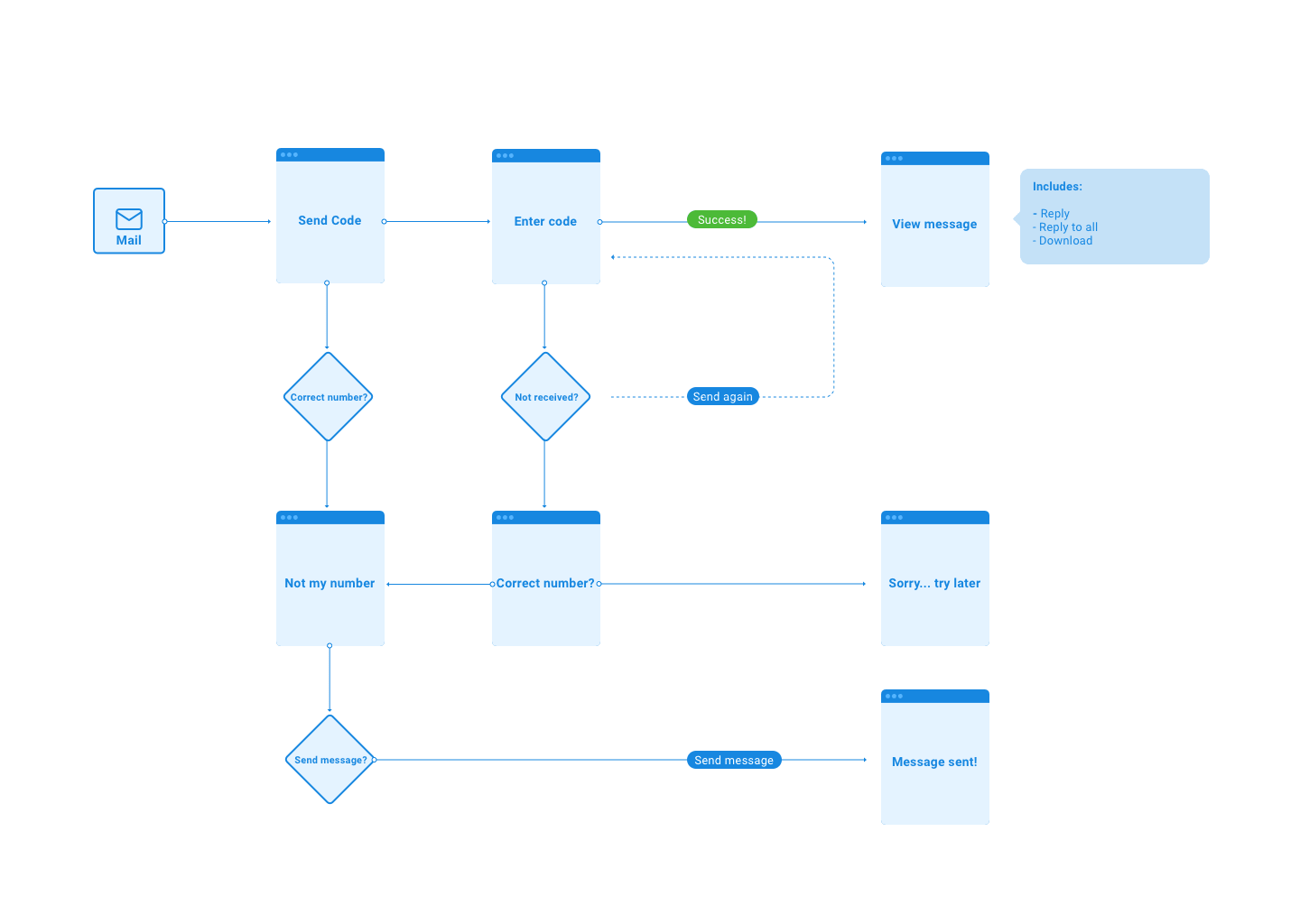
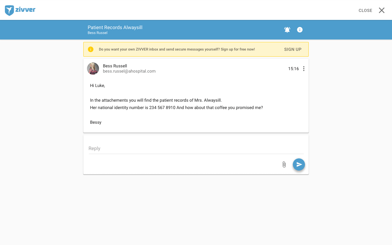
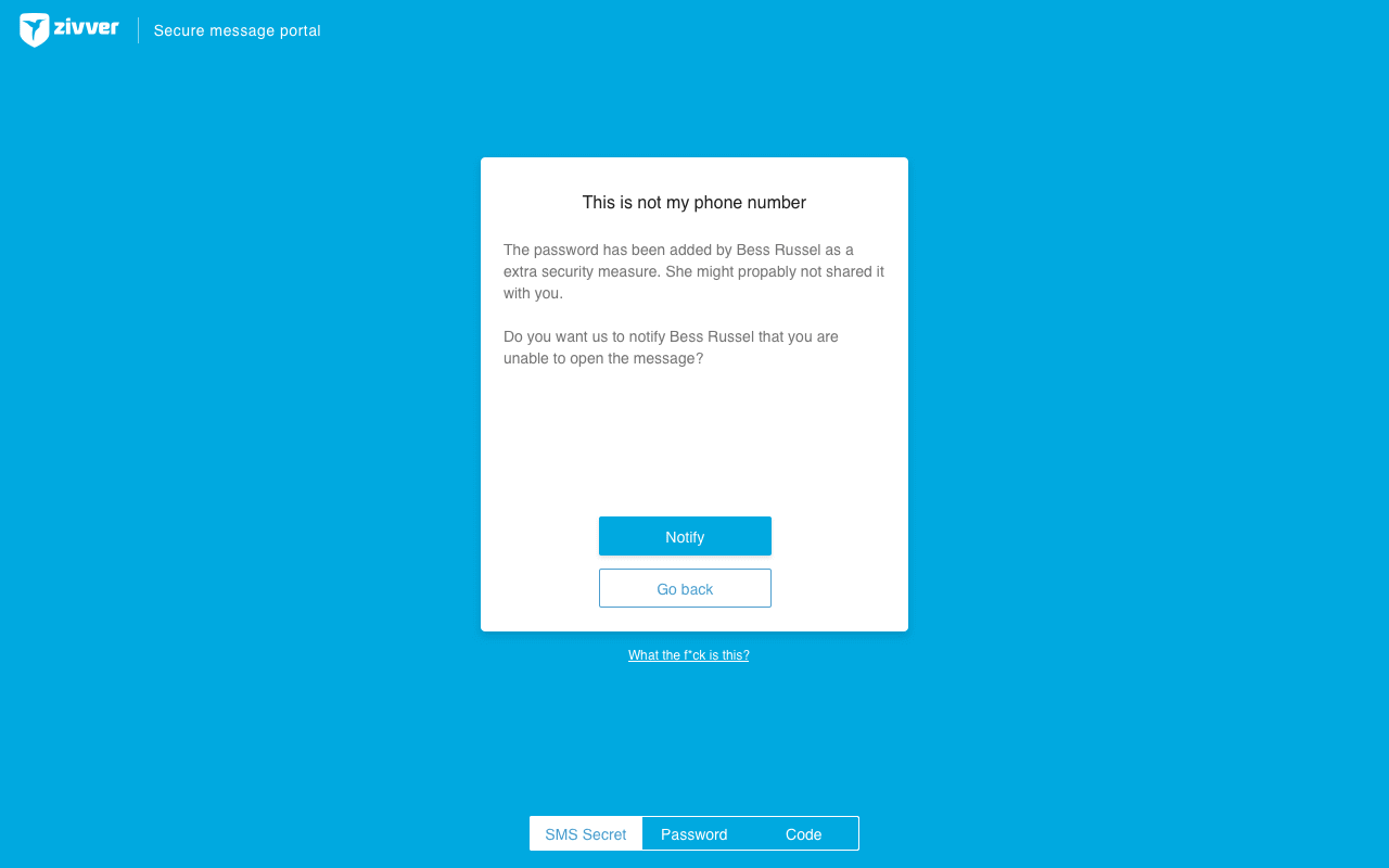
If the guest user was unable to open the message because he did not receive his authentication code on his phone, he was stuck. There was no way to recover the message, at least not in a secure way. So, we came up with a system to enable the user to send a message to the sender when he was unable to open the message. The sender could take action, for example, by changing the phone-number to the correct one.
Increase feeling of safety
Make the users feel safe
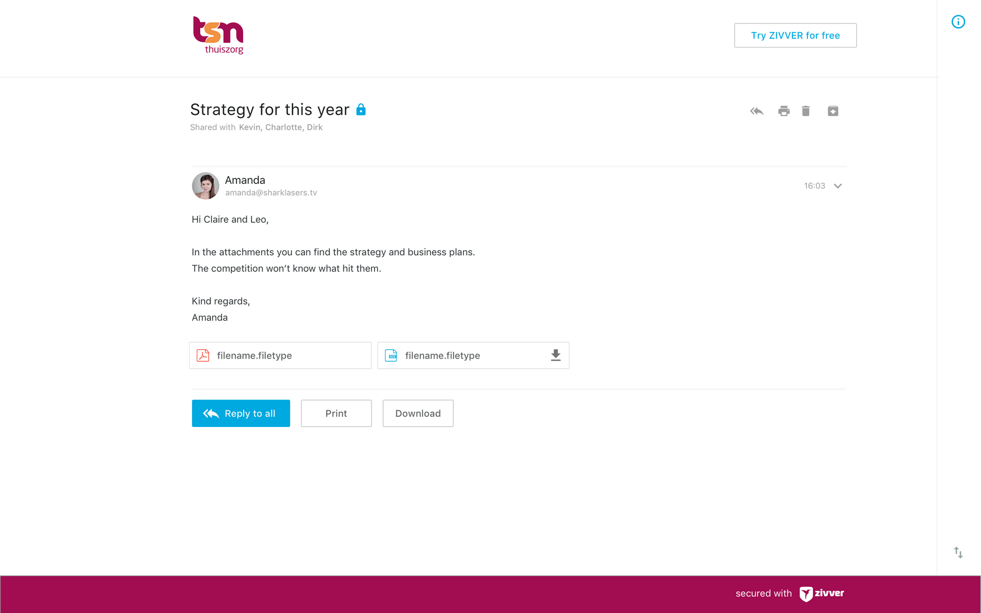
When the guest users receive a notification message from ZIVVER for the first time, it was (especially in the beginning) probably the first time they ever heard of ZIVVER. Since guest users are not familiar with the service, they might not trust the message. To earn the users’ trust, we started to brand the messages with the logo of the organization that was sending them. However, when the recipient clicked on the link provided in the message, he would still go to a different environment and might feel unsafe. We tried to find out what could give the user more trust, by testing different concepts for the guest environment.
We noticed that by showing the organization’s logo in the guest environment as well, it worked as a point of recognition and felt more secure to the guest user. In addition, we found out that users would feel more secure, if they had to go through some kind of login ‘wall’ to read the message. This ‘wall’ should feel like the login pages they were used to. Eventually, we came up with a design that supported a completely branded page and would feel like a regular login page.
Improve feedback
Because guest users don’t have an account, it is hard for them to return to the secure reply messages they sent to the original sender. Therefore, guest users need another way to make sure that their message has been sent. Besides a second notification mail to their own mailbox, we added extra feedback in the UI to clarify that the message was sent.
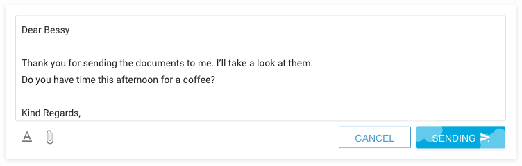
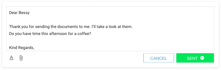
Furthermore, when the user clicked on the button to send a verification message, he would click it multiple times if he didn’t receive it immediately. As SMS verifications have some delay, we made the ‘SEND’ button inactive for a small period of time, and showed a small waiting indicator in the UI instead.
Give them subtle nudges
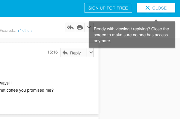
Security is difficult, because part of security is to break certain habits. For example, the habit of letting all tabs (and thus your history) open in your browser. It is a convenient thing to do, but as a result everyone can see your browsing history, which might contain some private information. Since ZIVVER messages probably contained this private information, and we wanted to make sure that users close the tab after they’ve read the message, we added small cues to nudge the user to close the tab.
Phase 3
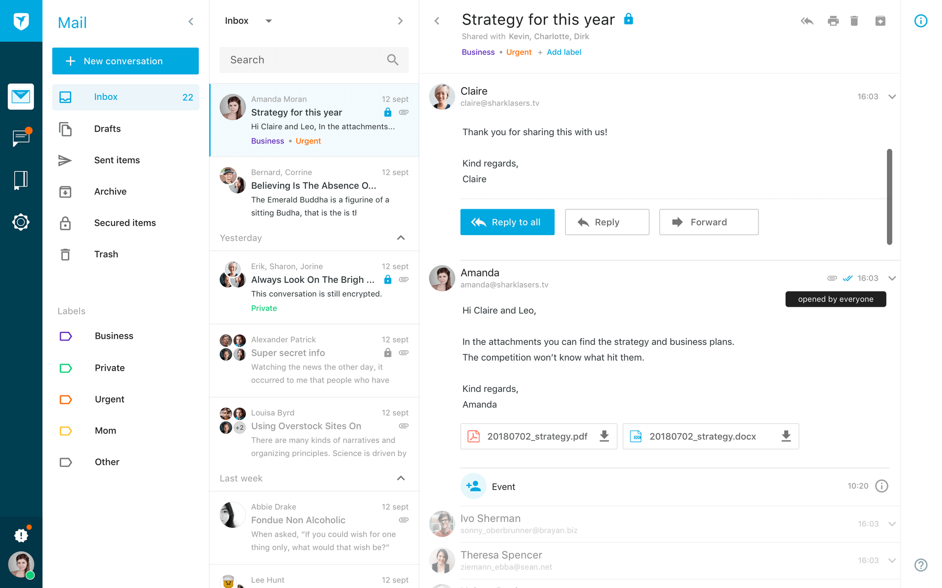
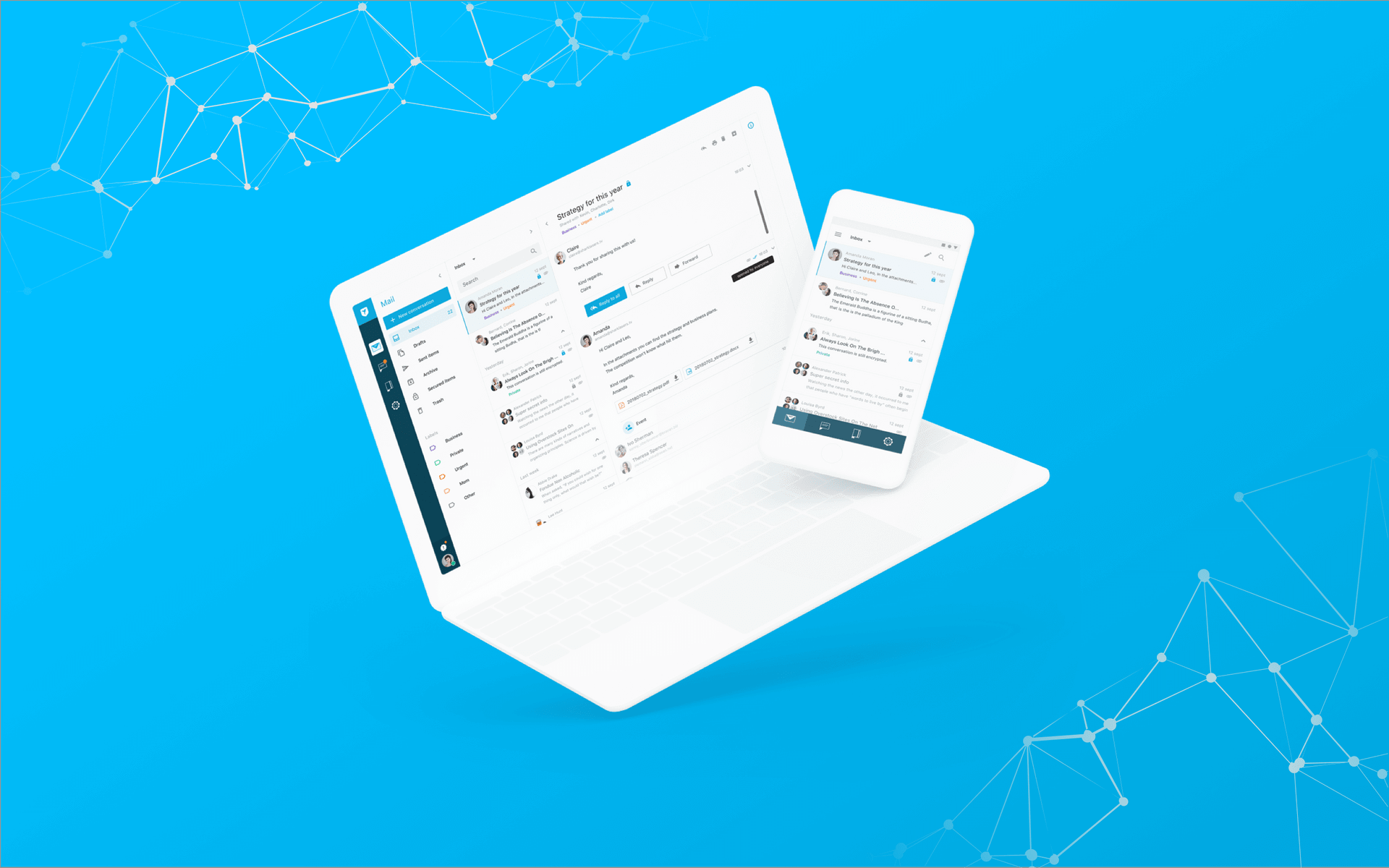
All improvements we came up with were small changes to the UI. However, we noticed that if we wanted to do this thoroughly, we had to start refactoring the whole design. Because ZIVVER started of as a mix of chat and email, some decisions were made in the UI in order to support this mix. But, after getting a bigger customer base, we found out that ZIVVER was mainly used as an email service, and users found it hard to use it as a chat service. Therefore, we needed to change the UI in order to make it feel more like an email experience instead of something in-between chat and mail (such as slack. It had to look more similar to, for example, Outlook. In the gallery shown below, you can see how this experience could look like. These screens were shown to a selection of users in an early stage of development, and we received a lot of positive feedback.
Read more on the product on the website of ZIVVER.