To prevent human errors, ZIVVER’s SaaS solution alerts its users before they send an email that contains sensitive information. The user can then decide if he wants to securely send the email (with ZIVVER) or unsecurely.
In order to do this, ZIVVER offers — besides its own app — plug-ins that can be integrated in commonly used mail clients, such as Microsoft Outlook and Microsoft Outlook for Web. Because people are familiar with these mail clients in their regular workflow, they are more likely to use the secure service. However, most users are obligated to use ZIVVER by their employer, and are probably less willing to use it. Therefore, we try to present these plug-ins as a helpful assistant instead of scaring the users with all kinds frightening security terms.
Personas
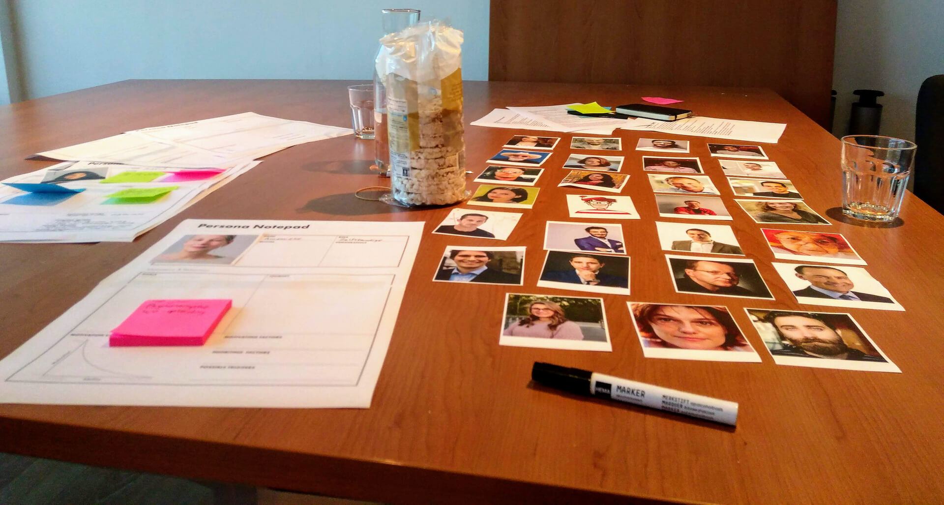
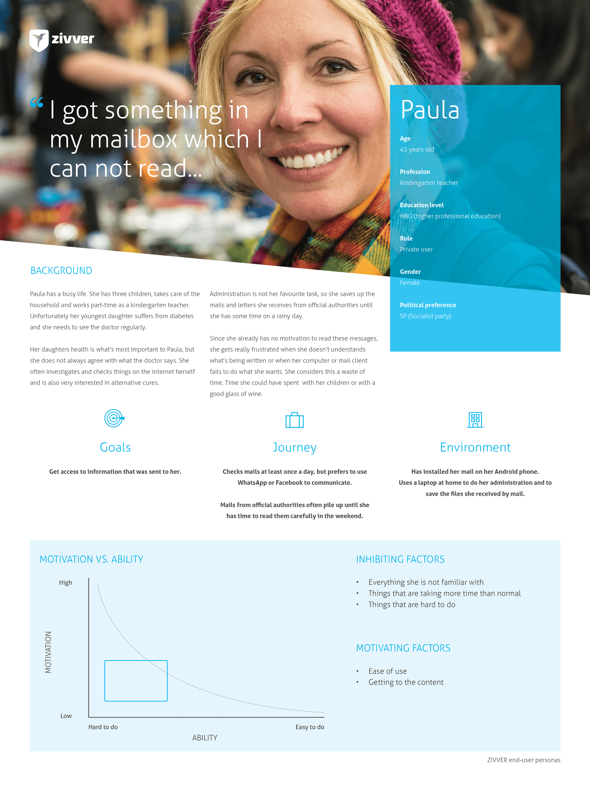
In order to get a clear picture of who is using the plug-in, I organised several sessions together with the support team to get a good impression of the end-users of ZIVVER. Furthermore, I joined several on-site implementation meetings to meet the users in real life. I eventually translated my findings to five different type of end-user groups, and I created a persona for each group. These personas helped the designers, but also the developers, to be more empathic with the users, and understand their pains and challenges when they use the service. The personas varied from users who would only receive secured messages to users who would also send secure messages.
Messaging
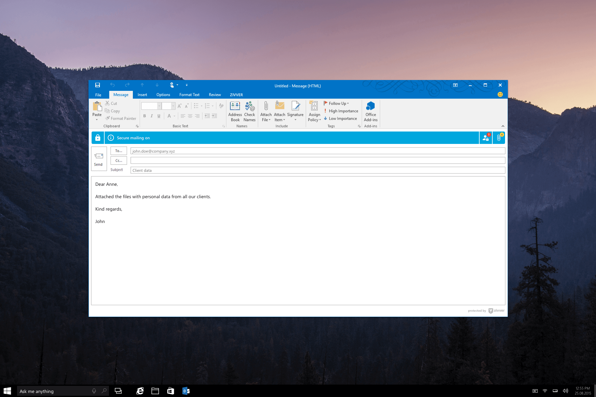
One of the key elements of the ZIVVER plug-ins is the notification bar. This bar alerts users of security issues that occur while they compose a message. Due to the space limit in the notification bar, we had to come up with very short and clear messages.
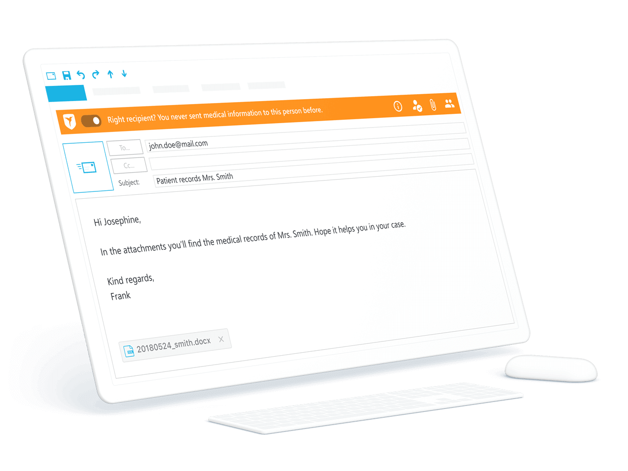
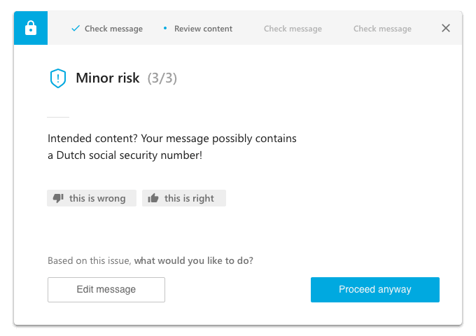
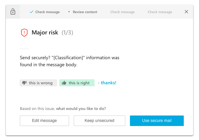
This proved to be very challenging: the message appeared to be unclear to many users. We found out that most messages were still ignored, and we had to come up with a different solution for alerting our users to security issues. So, instead of showing the notifications while the email was being composed, we also showed the urgent issues after the user had pressed the ‘SEND’ button. Because we were not restricted to the space of the notification bar anymore, we could use more of the screen real estate to explain a bit more about the issue. Furthermore, we were able to obtain user feedback to improve the alert system.
UI interactions
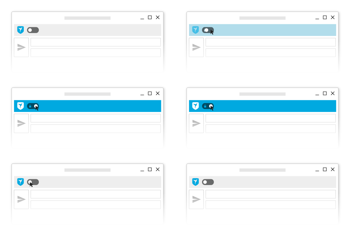
As we still had little room in the outlook message environment, and did not want to overwhelm the user, I tried to find ways to make the plug-ins more intuitive and simple. One of the improvements I came up with was the simple on-off switch.
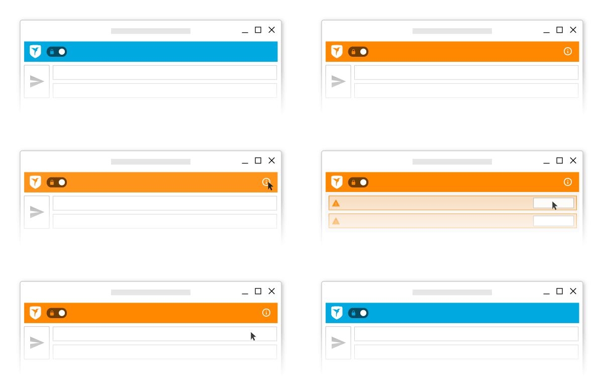
Besides clear messages for the user, we communicated issues by changing the colour of the ribbon. With an urgent issue, for example, the ribbon would turn red, while for less urgent issues the ribbon would turn orange. When multiple issues occurred, the user could fold out the ribbon to see each issue individually.
Redesign
After two successful years, and thousands of new features later, we decided that the ZIVVER ribbon needed a redesign. We collected a lot of user feedback and started designing from scratch again. Since security issues were still being ignored, we tried to add subtle animations to the ribbon to attract the attention of the user even better.
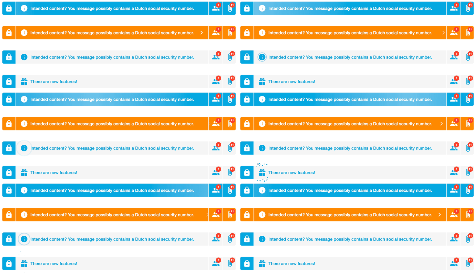
We also tried to make the on-off switch clearer by moving the ZIVVER logo to the bottom of the ‘COMPOSE’ window and showing the well known ‘lock’ instead. To keep the bar as clear as possible, we decided that actions that needed to be resolved should only be visible when hovered over.
Please do not hesitate to contact me for more information about the design process of this project, or read more about the product on the website of ZIVVER.


